Midwinter Financial Services

UI / UX
Responsive Design
Prototyping
Wireframing

The Insurance Needs Analysis Journey is a new product developed for super funds to provide simple and scalable advice to members. It offers high-level insurance recommendations based on personal and financial data, empowering members with actionable advice in a single session. Using a user-centric approach, I designed the journey to be seamless, engaging, and accessible for all users.

A laptop is positioned on a desk, displaying the welcome page of an insurance journey. The screen outlines the four steps of the journey, providing a clear and inviting introduction for users.
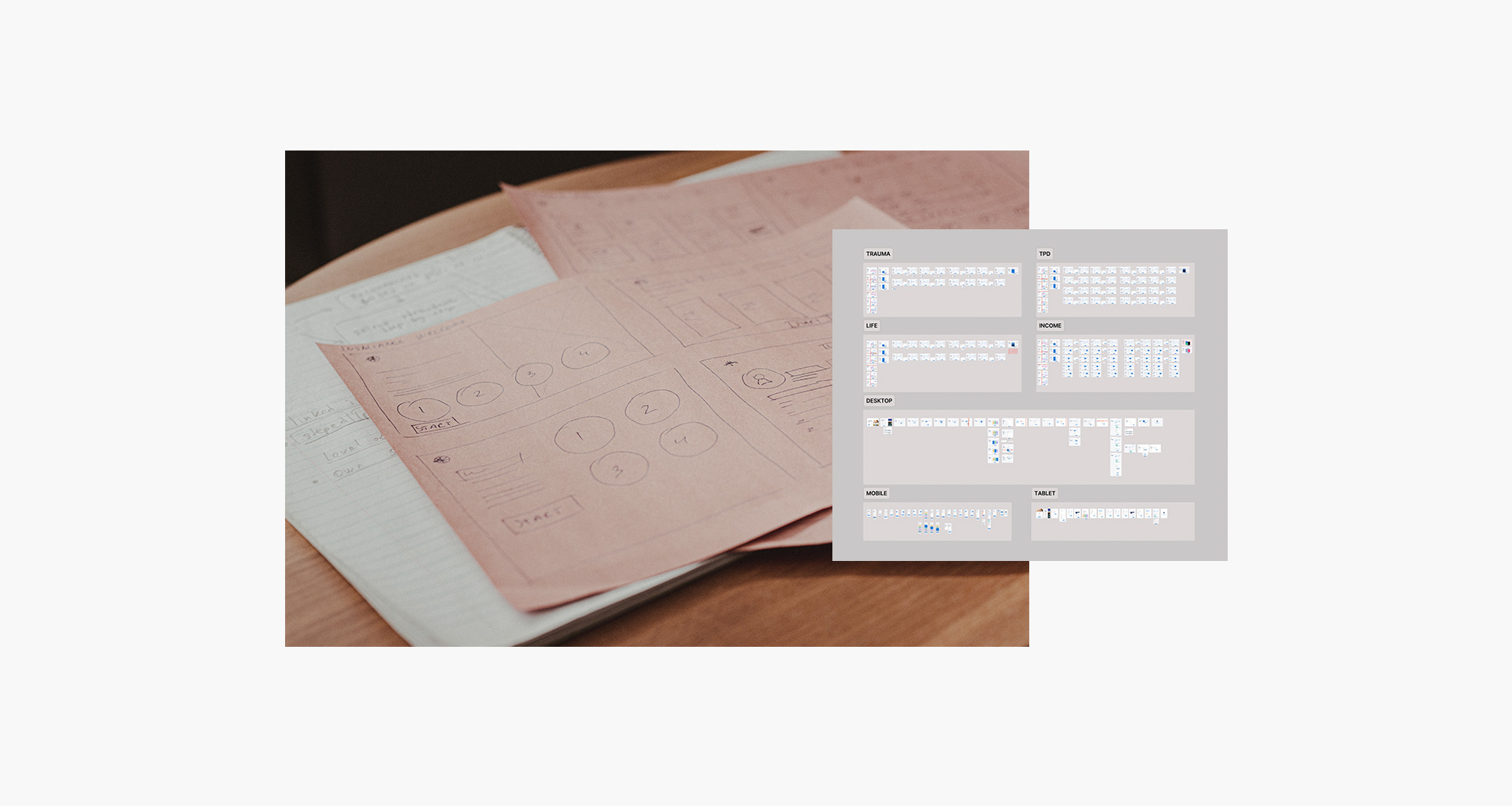
User persona and sketches of top screens of the journey.
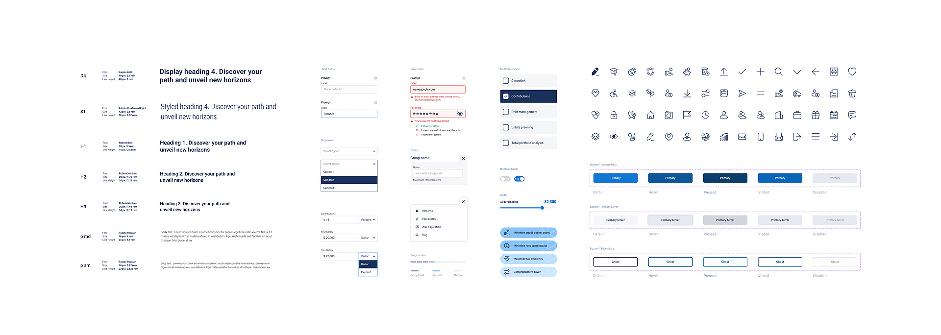
Design System uplift and maintenance. A collection of reusable components, typography, color and icons.
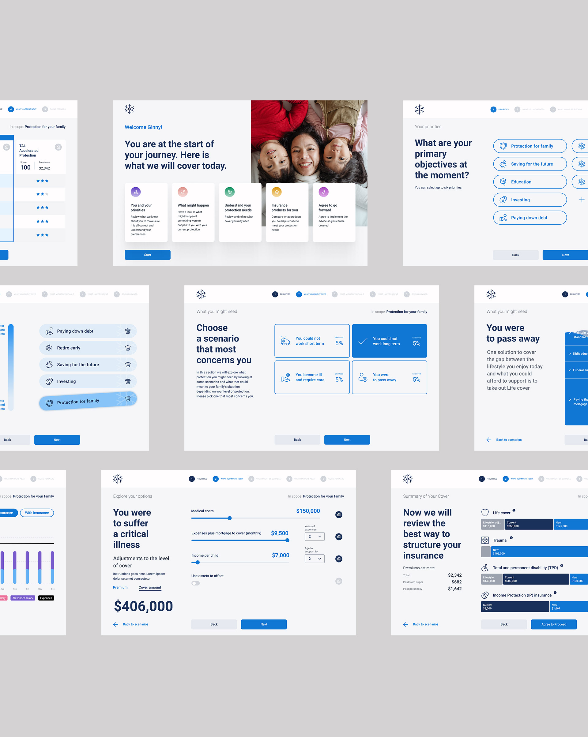
Desktop screens showing parts of the insurance journey.
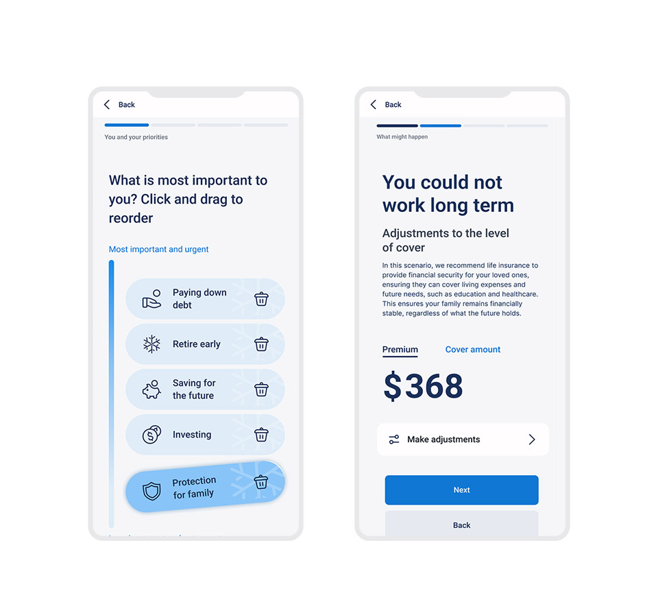
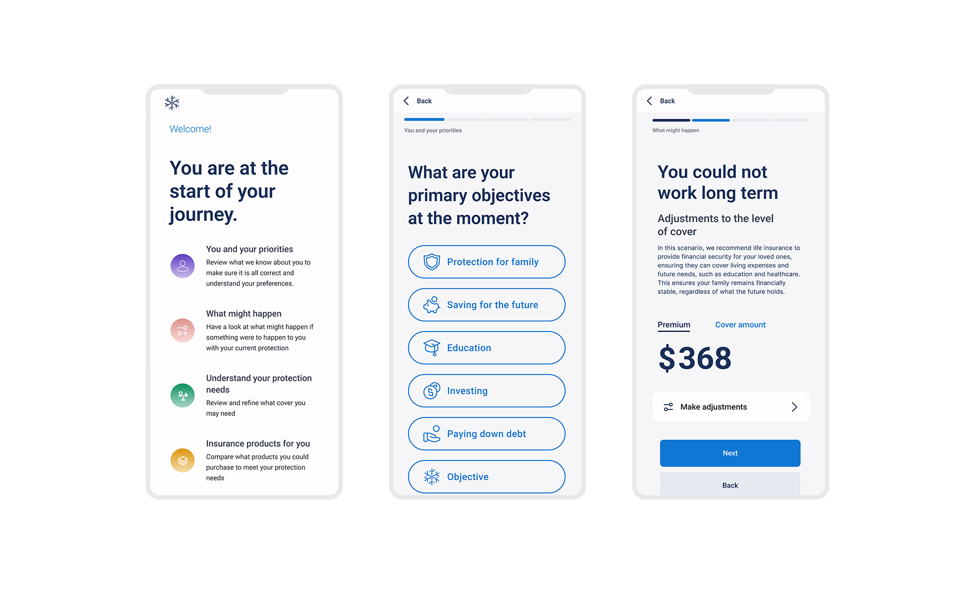
Mobile screens showing parts of the insurance journey.